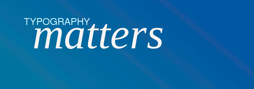
Typography is immensely important to the clarity and presentation of your content. If you’re not used to thinking about fonts, here are some tips to help improve style and readability:
- Keep it simple: if you’re planning to use more than 2 fonts, make sure you’re confidently going for a particular style because a lot of fonts can make a site messy and hard to navigate
- Vary headings & body text: make sure there is a clear difference between headings and the body of your text. This can be achieved in a number of ways:
- Alternate between a serif font (eg Times, Garamond, Georgia etc) and a sans-serif font (Arial, Helvetica, Tahoma etc)
- Use bold and italic to emphasise differences: eg set a heading in bold, then the body in italic
- Put headings in UPPERCASE to contrast with the body
- Take control of font sizes by making the heading much larger than the body text
- Ensure body text is legible: complex fonts can be great for very large header fonts, but can often be very difficult to read at normal text size. Make sure you use clear, well-spaced fonts whenever you want your audience to read more than a sentence of text.
- Keep an eye on current trends: every time you see some typography that you like, ask yourself why you like it and look at the details. Is it a nice font or a nice combination of fonts? Trends change fast, so you need to pay attention to keep up-to-date.
Customising your fonts on Folissimo
Each theme on Folissimo has a range of curated fonts, selected by the Folissimo team. If however, you would something more personal, then choose the “custom font” option from the fonts menu in the “Theme Editor” and then click “edit”. You will then be able to change the font, size, style and weight for your heading, menu and body text.
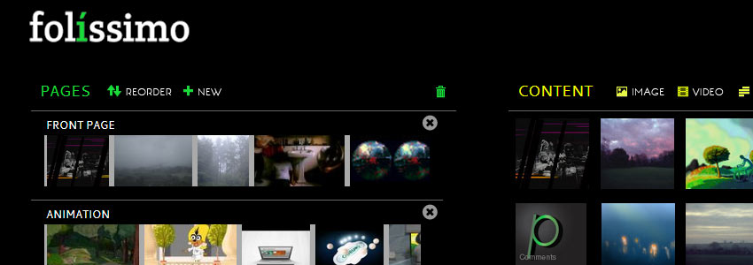
To coincide with the launch of our new frontpage, we've changed the look of the administration system. We're hoping that it's made it easier to find your way about. If it hasn't let us know ([email protected]).
More importantly, we've added a number of new features that give you more control over your content and reduce the amount of time you have to spend updating your site:
Font Customisation

Although we try hard to make sure that our curated font selections fit the bill, you may find that you want something a bit different: maybe you want a larger menu font, maybe you want your site title in UPPERCASE, maybe you want a completely different font for body text.
You can now choose "custom font" from the font list. Click "edit" and then experiment with the different fonts.
On most themes, "Primary Fonts" correspond to site titles and post headers, "secondary" to menus and subheadings and "tertiary" is the body text such as "text item" content and image descriptions.
Custom Backgrounds

On selected themes, it's now possible to upload your own background. This could be a repeating texture like a wood pattern, or it could be a large image.
To upload your own image, under the "colour" section in the Theme Editor, select "custom background" from the "Background" drop-down and then click "edit".
You will be able to upload a new background image. Once uploaded you can choose "tiled" to make it repeat across your background or "centered" for it to be stretched across the screen.
Workflow Improvements
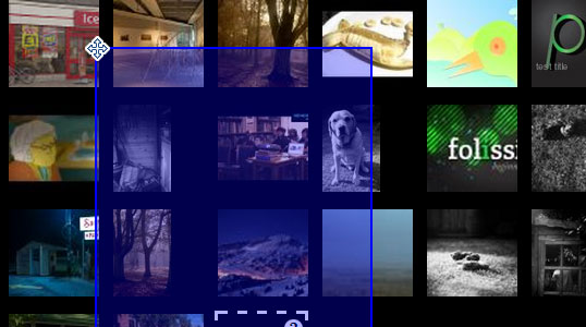
We heard how you have found it difficult to edit a lot of images simultaneously. As a result we’ve added more ways to edit your images: + right click on any item to open it in its respective editor + hold down shift and click on the content title to multiple select /deselect items + drag a box over the content to multiple select + edit all selected images by clicking on any title or right clicking on the image
As ever, please drop us an email : [email protected] or use our twitter or facebook if you have any questions!