Although we liked the previous design, it just wasn't doing the business:
An embarrasingly small number of users were scrolling down the front page to see the detailed explanation of Folissimo and many people were going away without understanding what Folissimo does: a total UX failure!
Back to the drawing-board
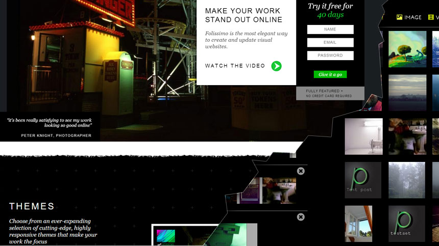
So we went away and thought about how we could simplify the proposition on the landing page, show off our themes as best we can and explain how great we think our administration system is.
We were initially going to go for some really fancy parallax-animating backgrounds, but we were finding it hard to keep them smooth with all the images and textures on the page.
We decided it was really important to keep people focussed on the key points:
- the themes
- how you can customise them
- the admin section
- signing up
We settled on big alternating white and black strips, keeping the torn edge that we used in our first design and making the most of the wonderful jQuery Flexslider plugin to move content horizontally across each strip.
Having got fairly happy with the new frontpage, we now had to look at the admin section which badly needed some designing!
Back to the back-end
We had initially thought that the backend would be a 2-minute job, but it ended up taking a good few days of experimentation with almost every colour combination imaginable before we ended up with something that both matched the new landing page design and was also attractive and functional.
As is so often the case with design, it took a few days of adding unending amount of details to realise that it was best being stripped down to the bare minimum.
So there we have it: a new look and a new(er) Folissimo.
Let us know what you think!
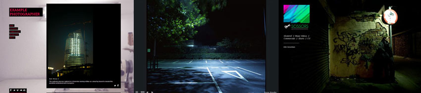
We've just released 3 great new themes:
Caramba
Caramba is a beautiful theme, great for video and project-based creative professionals.
The front page is a large splash page with a subtle menu and the subsidiary pages cascade image previews at the bottom of each page with one, large focal image at the top.
See Our preview here
Villalobos
Villalobos is a minimal theme designed for photographers who want their work full-screen.
The nuts and bolts of the site such as your contact details, site description and menu is all concealed at the bottom, sliding up when clicked on.
Fine art photographer Peter Knight is using the theme beautifully.
In The Air
In The Air was designed for people that wanted to make use of the new custom background feature.
Content is positioned vertically and overlays a fixed background image. This is great if you want flexibility in the type of content you display and might be ideal if you need to mix soundcloud embeds in with your photos or videos.